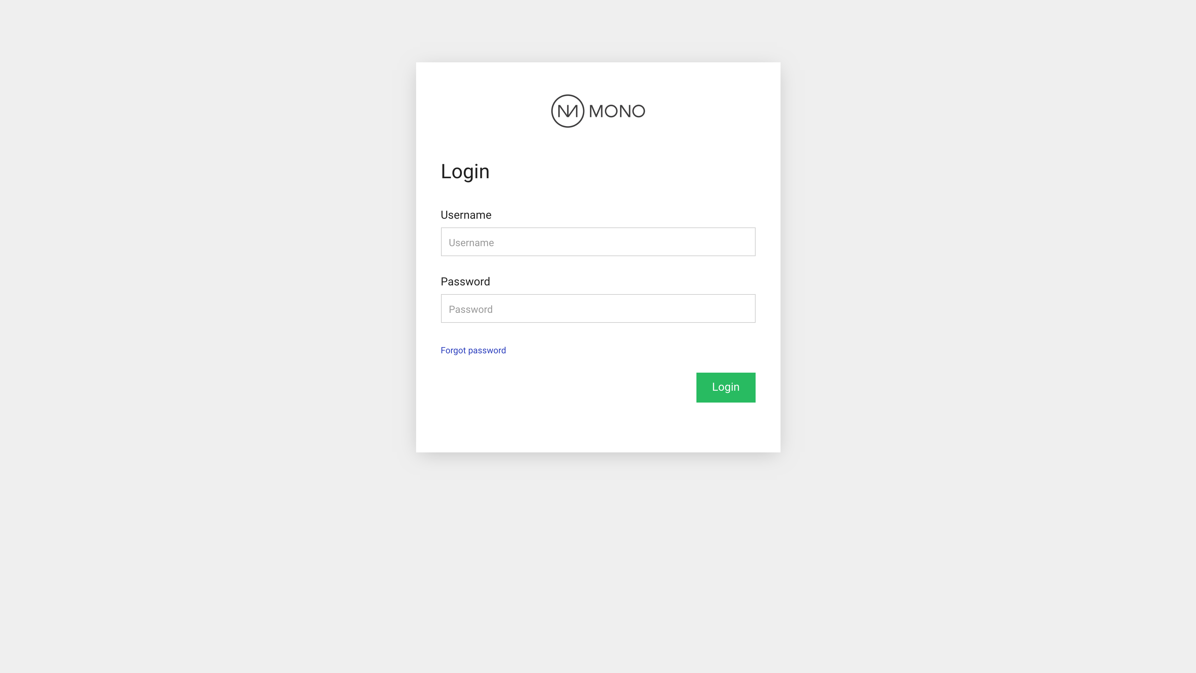
You have the option to make styling and content changes to the login page your end users log in to the Editor from.
Locating the end user login page
When your customers want to log in to the Editor and edit their website, they do so through a dedicated login page that Mono has created for you. The page appears as a regular website in the sites overview in RAI and is titled "LOGINPAGE DO NOT DELETE". It is usually one of the first sites that were ever created on your RAI account.

Access it by clicking the TOOL icon at the far right.
Login page layout
The login page consists of a single row with three columns. The middle column contains an Image module with your logo and the Website login module (read more below).

You can customize the background on the end user login page by adding a background image on the row. Here, you can add any image of your choice.
You can also replace the logo image on the Image module if you wish.
Login box size
If you want the login box to take up more space on the screen, simply delete the empty columns on both sides of the box.
Edit the Website login module
The content and styling of the login box is edited in the Website login module, which is unique to this particular end user login page and cannot be found on any other types of websites in the Editor. When opening the module you'll see the following options:
Content
- Checksum: a value inserted by Mono which links the Website login module specifically to your reseller account in RAI. Please don't edit this field.
- Username: this text will show as the Username field label and is pre-filled in the input field.
- Password: this text will show as the Password field label and is pre-filled in the input field.
- Button label: the text you want to appear on the Login button.
- Logout URL: the URL you want your end users to land on when logging out of the Editor. As a default, it is set to land on the end user login page.
- Forgot password label: the text on the link users can click if they have forgotten their password.
- Error message text: type in a message that is displayed to users if their login attempt fails.
Design
Style the appearance of the various field labels, input fields and the Submit button on the module. For a more thorough introduction to styling, see our dedicated styling guide.