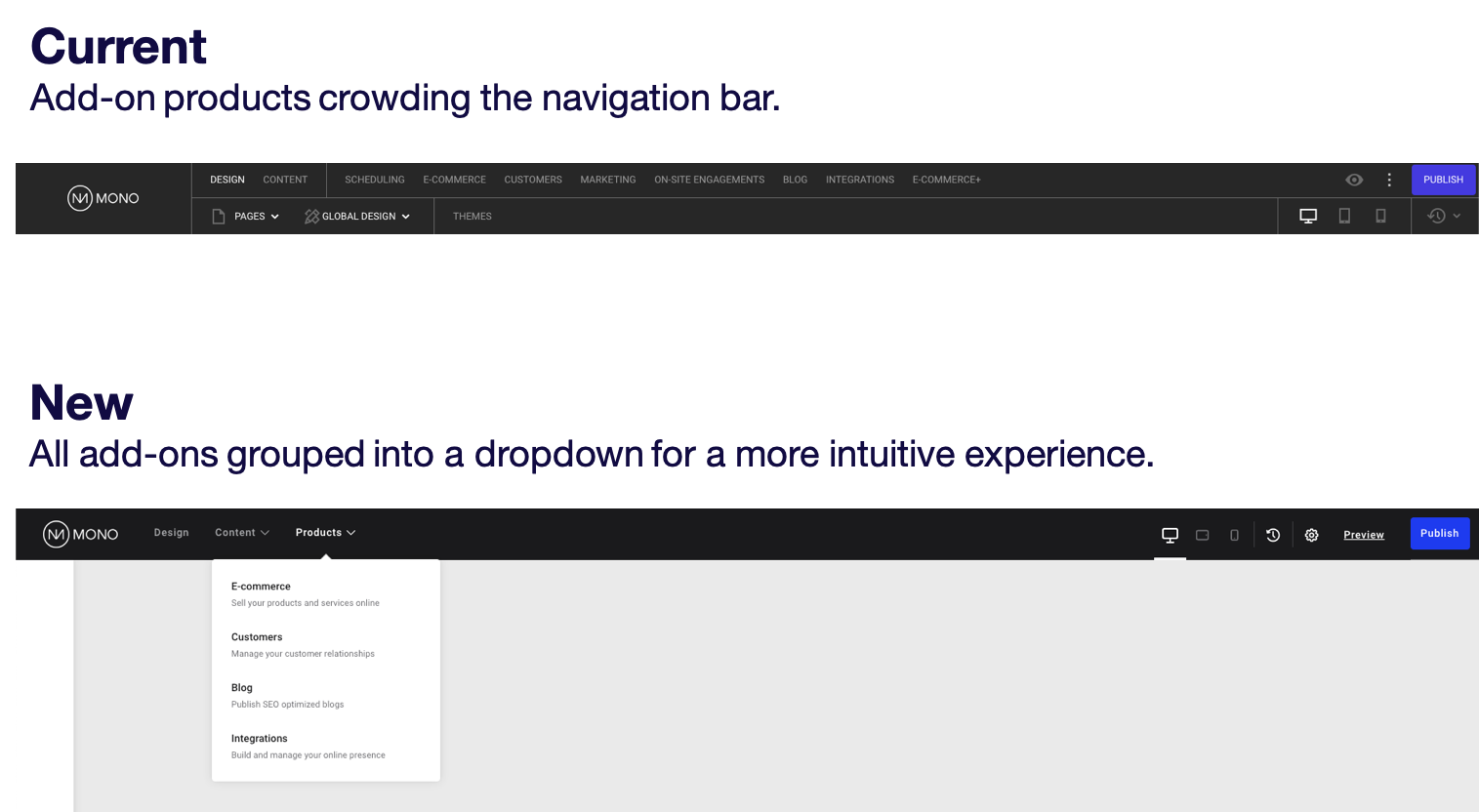
As announced on Mono's yearly product roadmap webinar, 2021 will see a range of significant improvements to the Mono Editor UI and general user experience. In short, the Editor will soon look a lot better and be much easier to use. First on our list is the Editor's main navigation.
We always strive to be transparent about our product development and clearly explain why things are changing. In this article, we'll walk you through the updates to the Editor's main navigation, why we've made the changes, and what value they provide to you and your end-users.
Introducing an all-new sidebar
The most noticeable change is the introduction of a secondary sidebar navigation that will be visible whenever the user is working in the Design tab.
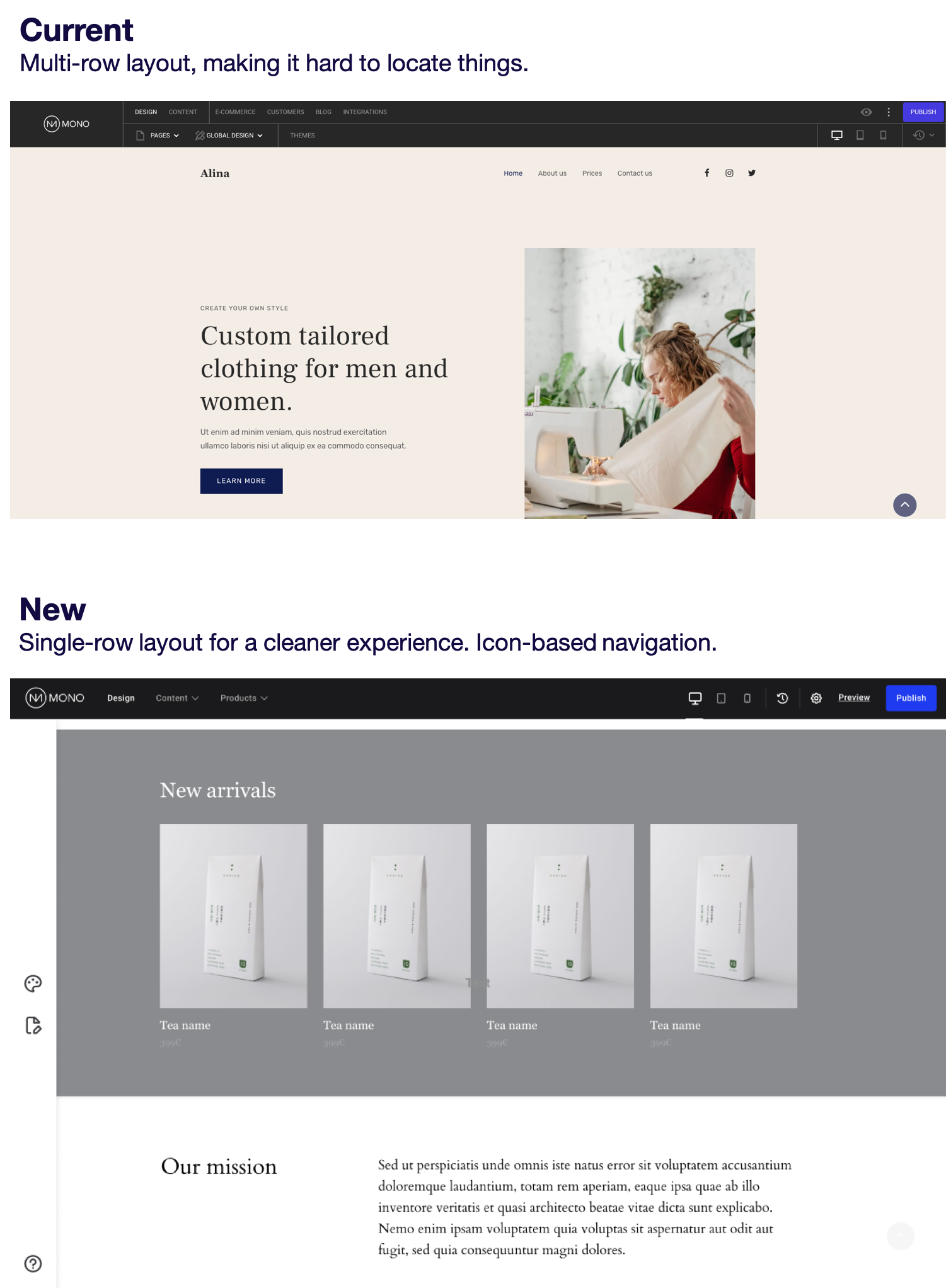
One of the main pain points for many users of the current Editor navigation is that it's crowded - it simply contains too many options and is therefore forced to split them into two rows. This doesn't provide an intuitive user experience, especially for new users.
By moving Global Design, Manage pages and Help to the sidebar, it's a lot easier for users to make sense of where to find things.
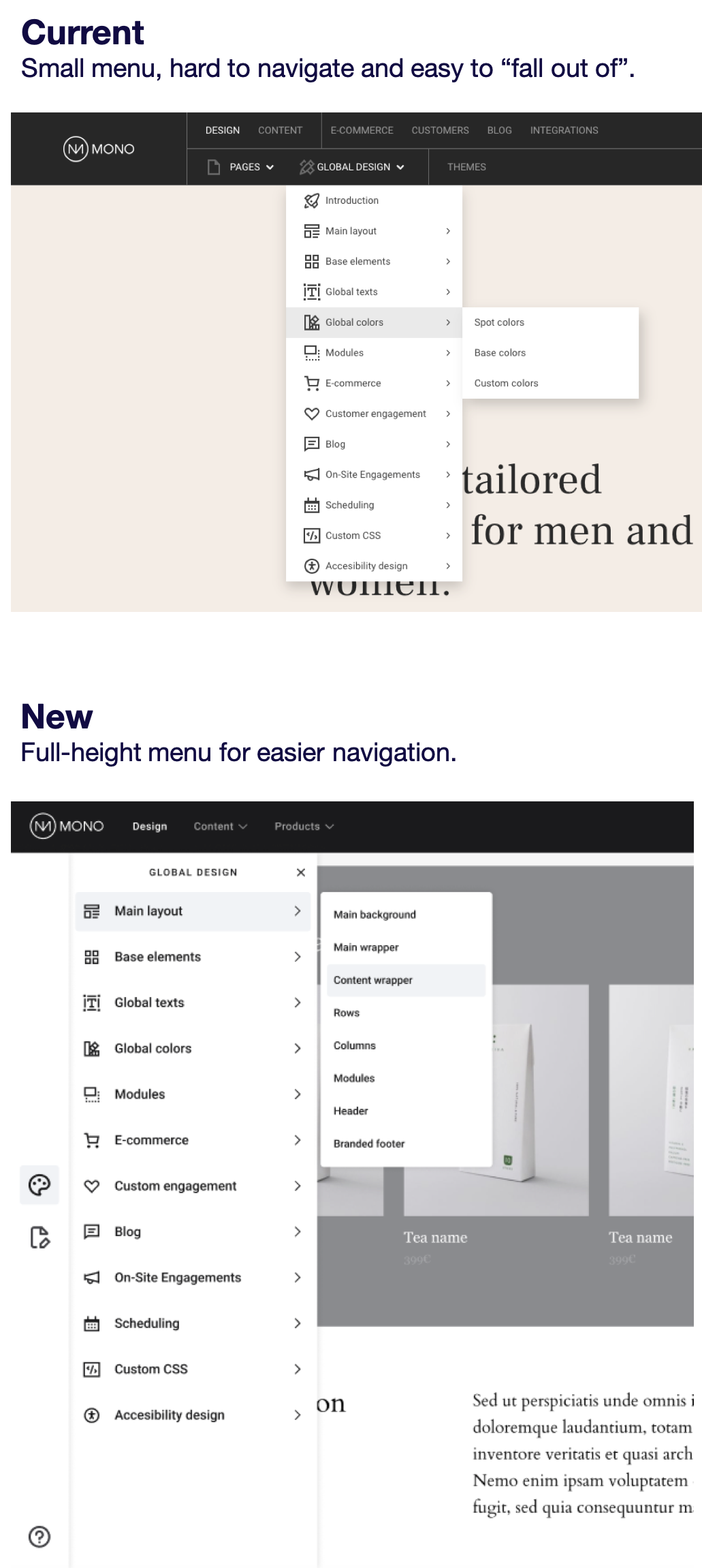
Easier access to Global Design
In the current Editor navigation, Global Design is accessed from a small dropdown in the top navigation. Users often found it hard to navigate this menu and requested something visually bigger. By moving Global Design to the new side navigation, the menu is allowed significantly more space, making it easier to find what you're looking for while reducing the risk of clicking on the wrong menu item by mistake.
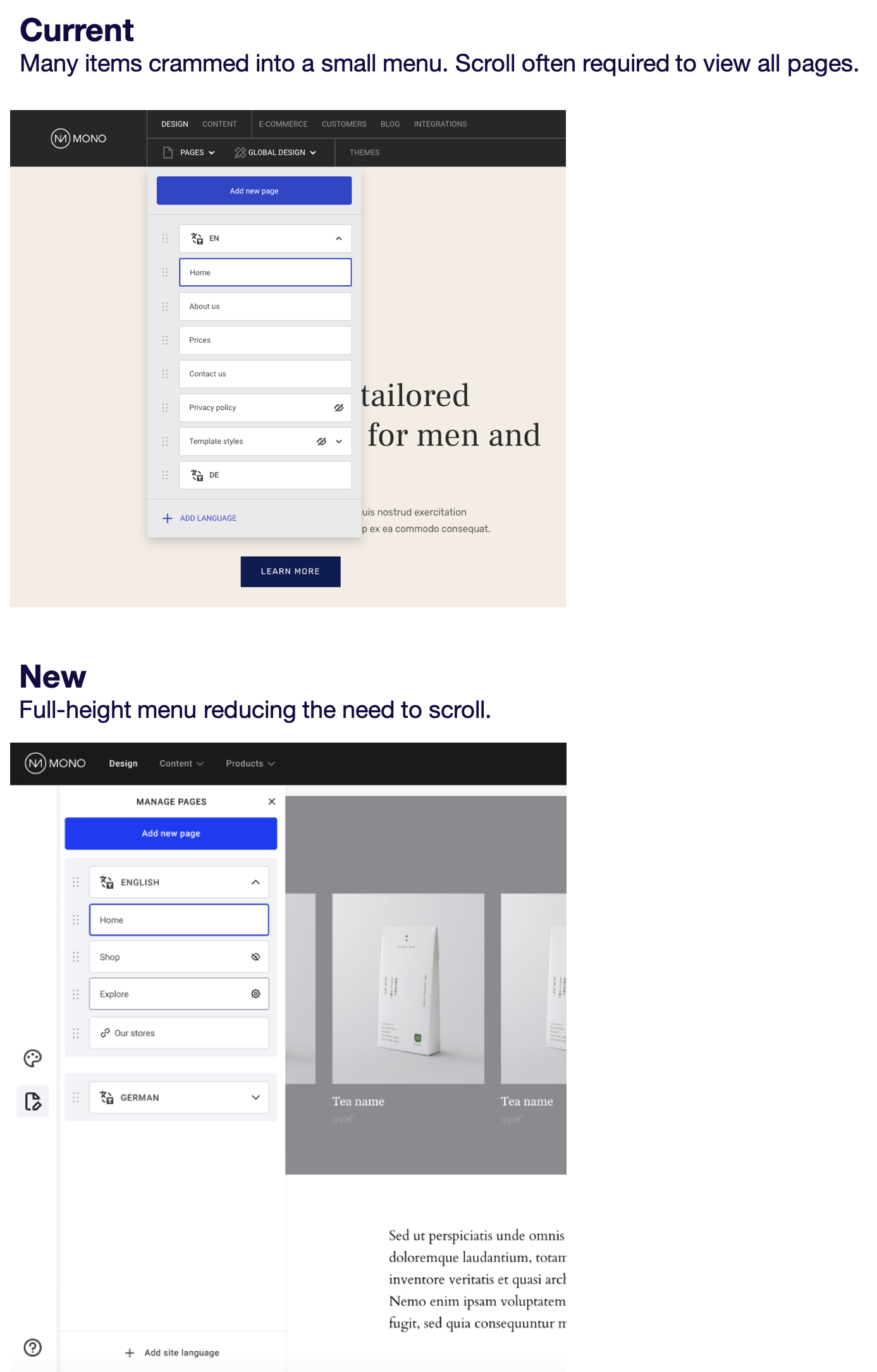
More room to manage your pages
Manage pages is currently accessible from the top navigation but that puts a number of restraints on how much space it's allowed to take up. By moving it to the side navigation, you likely won't need to scroll in order to view all your pages and the various buttons and actionable items have more display room.
More "human" design
The key aesthetic value driver for us has been to make the Editor more approachable. This has translated into a more human design that focuses on making it enjoyable and comfortable for users to work in the Editor.
New fonts and font weights
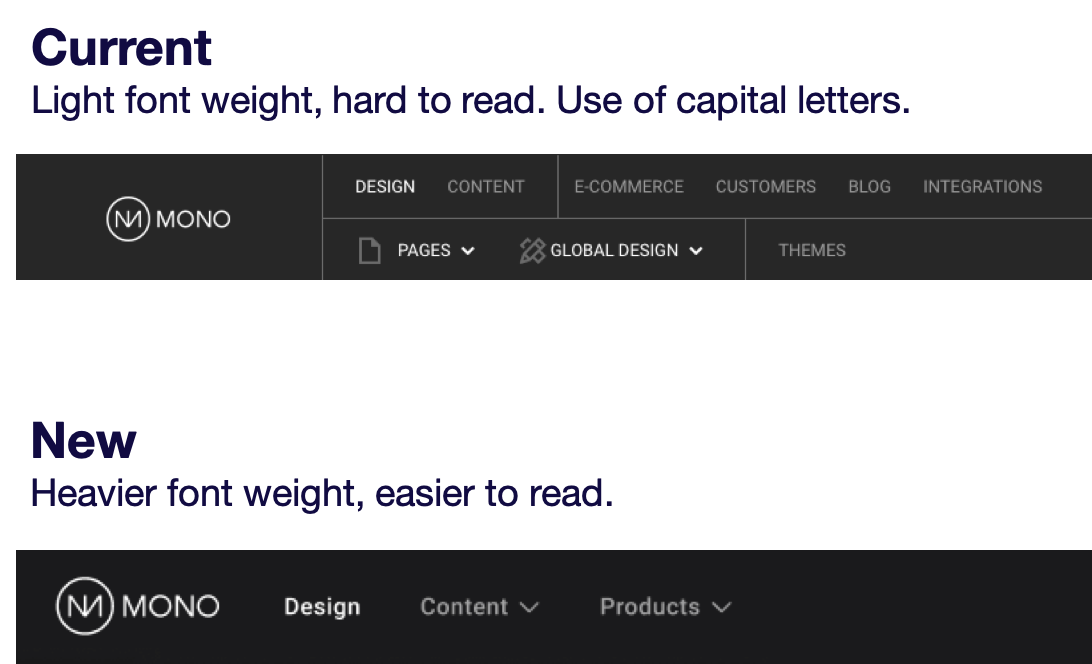
All menu items in the current navigation were written in capital letters with a fairly light font-weight, making it hard to read the words. We're replacing them with a font type that is much easier to read.
Rounded corners
All buttons, modals, tooltips, and hovers will have rounded corners instead of sharp, providing a softer visual expression.
AA/AAA compliant color palette
The colors and contrasts in use on the new navigation are all adhering as a minimum to the AA criterion for use of accessible colors with the majority also being AAA compliant.
Better user guidance
We've made significant efforts to provide better visual guidance for users, helping them quickly understand where to find what they're looking for.
Hover states
We're highlighting the item that the user is hovering on, making it easier to see exactly where your cursor is and helping to avoid clicking something unintended.

Tooltips
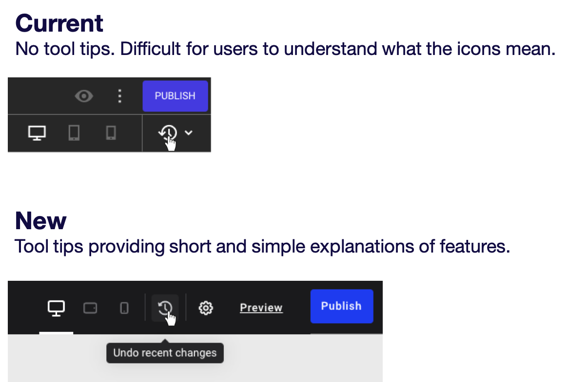
We're adding tooltips (help texts) on all icons and buttons to help users immediately understand what a feature does.
More intuitive user experience
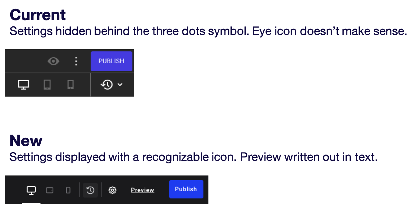
Based on some of our research and user testing with the current navigation, we discovered that new users often found two things confusing: they either didn't notice or couldn't understand what the three vertical dots next to the Publish button mean; and they had a hard time figuring out what the eye icon was supposed to do. We've made that crystal clear in the new navigation.
Simple is better
We're trying to keep everything as simple and streamlined as possible to ensure there's a consistent use of logic and meaning behind every feature.
No more Themes
A big change is that we're getting rid of the Themes feature. Based on our research and interviews, it was very hard for users to understand what changing the website theme actually meant (overwriting styling but not design and content). As a result, the feature was hardly being used and we're therefore removing it.
No separate navigation design for Simple Editing user role
The Mono Editor comes in a "Simple Editing" version where certain features are stripped out or simplified. This resulted in Admin users having access to Global Design and Simple Editing users to something called Quick Styling, essentially creating two different navigations depending on user role. In the new navigation, we've made sure that there are no longer multiple interfaces. If Admin users click the Design icon on the new sidebar navigation, it opens up Global Design. If a Simple Editing user clicks the same icon, it opens Quick Styling.
Add-on products accessible through a dropdown
In the current navigation, all add-on products are listed individually. If you have more than a few add-ons, the navigation bar quickly gets busy and cluttered. With the new navigation, we're grouping all add-on products into a convenient dropdown called "Products".
