Under the category Text and structure in the Add module overlay, you can add an Accordion module by selecting Accordion. The Accordion module allows you to add blocks of content which can be expanded and collapsed as the visitor clicks on the different elements. Popular uses of the accordion module include providing answers to frequently asked questions (FAQs) as well as showcasing different services.
In the module overlay, there are three areas in which you can edit your Accordion module: Content, Design or Settings.
Content
When adding a new element to your accordion, you will see the following content options:
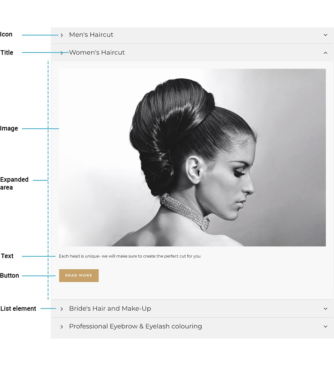
- Title: the title is the only text visible when the element is collapsed.
- Icon: this adds a unique item icon to the list element.
- Text: the text will only be visible when the specific list element is expanded. You can add basic formatting to the text, insert links, add Global Data tags, and more.
- Image and alternative text: add an image from your File Library or your computer. You can also input an alternative text for the image for accessibility and search engine optimization purposes. If you have added both text and an image, the image will be placed before the text.
- Button label, link and icon: add a button label and a button will automatically be added to your Accordion module. You can link the button to an external URL, an internal page, an email or a file for download. Finally, it's also possible to add an icon to the button.
Once you have added multiple elements to your accordion, you can change the order of them by dragging an element to another slot.
List icon: select an icon in this section if you want to use the same icon for all your list elements.
Design
The Design section is where you change the background, border and spacing of your Accordion module. For more specific styling options, click on More local design options. There you can customize the following:
- Title: define font type and settings as well as alignment and spacing.
- Image: in this section you can define image size, alignment and spacing.
- Button: define background, text styling, spacing, etc. for your buttons on the accordion.
- Icon: set icon size and color, background color, border properties and spacing.
- List elements: style the title area that's also visible when an item is collapsed. You can set background, border and spacing.
- Expanded area: style the area that's visible when an item is expanded. You can set background, border and spacing.
For a detailed walkthrough of all styling parameters, please refer to our styling guide.
Settings
In Settings, you can specify whether you, by default, want one list element to always remain expanded or allow visitors to collapse all of the list elements. Toggle Allow collapsing/expanding all items if you want your list to be completely collapsable, as illustrated below.
Examples
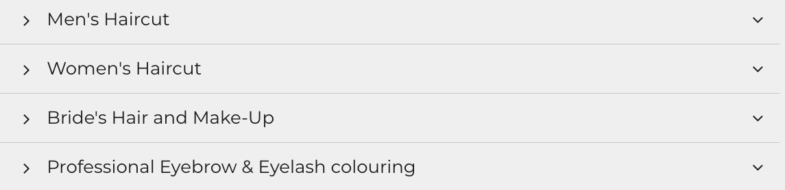
Here you can see an example of how the accordion module is used to present frequently asked questions (FAQs) and the respective answers. Here each question is set up as a different element, with only the title and text content options used.
Additional elements can be added by clicking Add Element. Note that you can choose to add an element to either the top or bottom of the list. If you wish to further move the elements around, you can hover over the six dots on the left-hand side of the element and drag and drop the elements to the desired location in the list. Interested in creating FAQ lists? Another option is using the FAQ list module.
In the example below, see how the Accordion module is used to showcase the different services a hair salon provides; utilizing more of the content options available including icons, images and buttons.