Buttons
Buttons make it easy for your visitors to find the information they need and is also an effective way to encourage them to visit specific pages on your website. You are able to customize the following values:
- Float (left or right)
- Width
The Button module can be styled in the states All, Normal and Hover. The elements that can be styled per state are as follows:
- Background color
- Button size (padding)
- Border (style, color, thickness, radius)
- Font weight
- Color
- Text decoration
- Font family
- Font size
- Letter spacing
- Paragraph height
- Font case
- Icon color
- Icon size
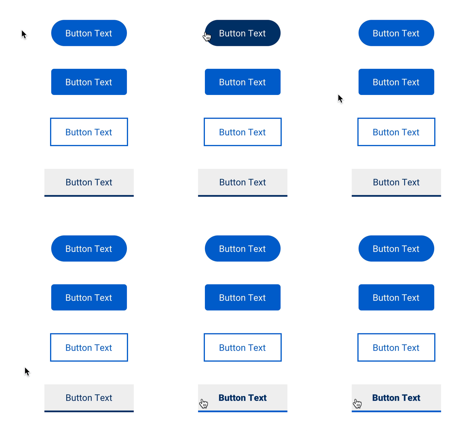
Examples of various combinations of the styling parameters above added to buttons:
Divider
The Divider module allows you to visually split up your content by adding a fully customizable divider line to any row or column. This module can be styled with the following values:
- Divider type (none, solid, dashed, dotted)
- Color
- Thickness
- Width
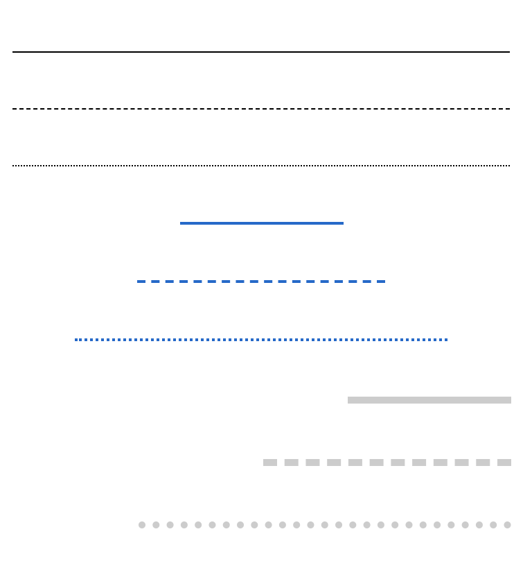
Examples of some of the styling parameters above added to dividers:
Icons
Icons are a good way to add attention-grabbing visual elements to your website. They can be used in call-to-actions, button labels and even navigation elements. Icons are another type of element that can be customized on a per state basis. Using the All, Normal and Hover states, you are able to customize icons with the following values:
- Color
- Icon size
- Background color
- Background width
- Background height
- Border (style, color, thickness, radius)
Examples of some of the styling parameters above added to icons:
![]()
Images
There are many great ways to add visual elements to a website and the most common is with an image. The Image module can display both still and animated images (GIFs). After you have added the module to the page and uploaded an image, you are able to style it to your liking using the following options:
- Image size
- Float (left or right)
- Image hover
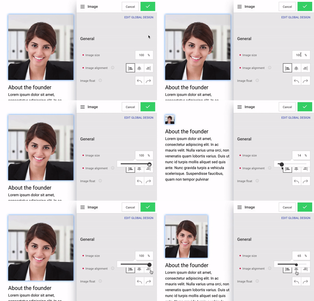
Image list and Gallery
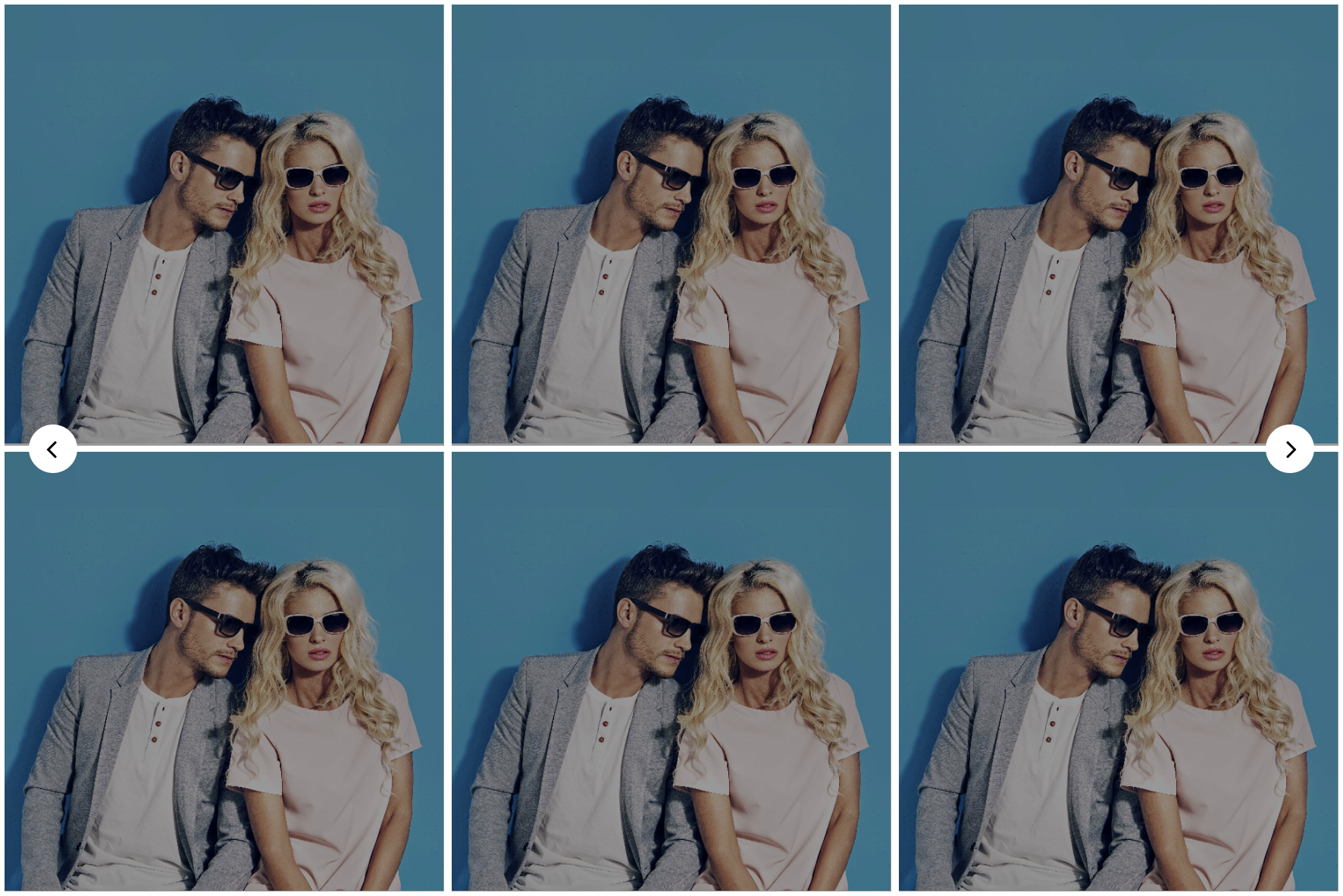
The Image list and Gallery modules offer the ability to display multiple images at the same time in a dynamic and interactive way. There are many different layout and styling options within these modules. After adding one of the modules and uploading images, you will be able to choose how many images you want to display, giving you the option to create a slider (displaying only one or a few image at a time) or a thumbnail gallery (displaying multiple images at a time). Other layout options include amount of columns to display along with how much margin or spacing you would prefer between each image. Finally, you have the option to display arrow navigation, circle pagination or no navigation at all.
Arrow navigation
The arrow navigation element can be styled in the states All, Normal and Hover. You are able to customize the following values:
- Arrow icon color
- Arrow icon size
- Arrow icon background color
- Arrow icon background width and height
- Arrow icon border (style, color, thickness, radius)
Pagination dots
Pagination dots are useful when you want to indicate to visitors how many slides exist in a gallery - each dot represents a slide in the gallery. You are able to customize the following values:
- Width
- Height
The pagination dots element can be styled in the states All, Normal, Hover and Active. The elements that can be styled per state are as follows:
- Background color
- Border (style, color, thickness, radius)
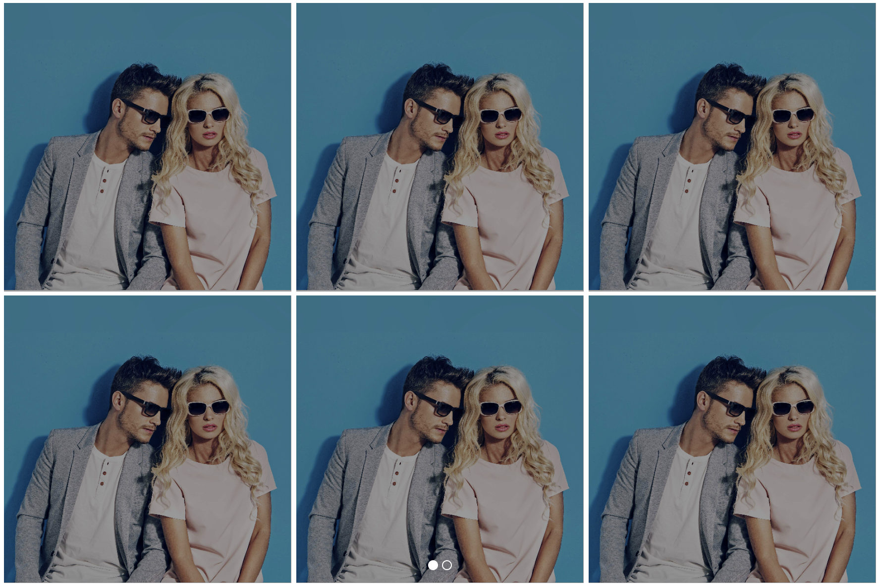
Image hover
Individual images in the Gallery and Image list modules are also able to take advantage of the Image Hover effect. The principles and styling techniques are the same as they are for the Image module.
Input fields
Input fields are the elements that make up the structure of a contact form. The options that can be styled are as follows:
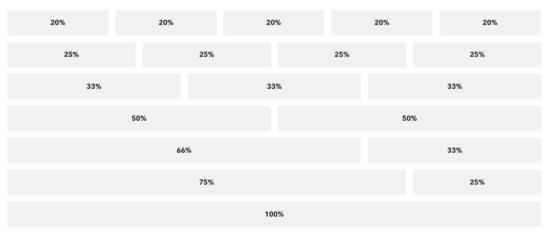
- Field width (20%, 25%, 33%, 50%, 66%, 75%, 100%)
- Margin between fields (determines how much space exists between input fields)
- Stack each input (checkbox and radio labels only)
- Background color
- Border (style, color, thickness, radius)
- Font weight
- Color
- Text decoration
- Font family
- Font size
- Letter spacing
- Paragraph height
- Font case
Field width allows you to customize the layout of your form fields, giving you full flexibility when creating more advanced forms. Below is a grid that displays how form fields can be set side-by-side.
Links
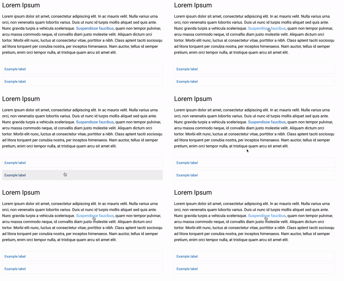
Link styles inherit from Global Design > Global texts > General text > Link, but you are able to customize them on a per module basis as well. Links found in modules such as the Text module or Link and download module will offer states of All, Normal and Hover. You have the option to style links by selecting the following values for any of the states.
- Font weight
- Color
- Text decoration
- Font family
- Font size
- Letter spacing
- Paragraph height
- Font case
Examples of link styling in the Text module and Link and download module:
States
In certain areas of the Editor, you will see an option to style elements by states. States can include options such as All, Normal, Hover and Active. Elements can be styled differently depending on what state they are in.
- All - applies a value to all states
- Normal - a normal, unvisited link/element
- Hover - a link/element when the user mouses over it
- Active - a link/element the moment it is clicked, for example the page the visitor is currently browsing

If you have selected All, any value that is styled will be applied to all states. Furthermore, if you select Hover and change the color to a different style, the new color applied will only appear when the cursor hovers over the element.
Approach to styling with states
It is often a good idea to begin styling at the All state level. Often times the All and Normal states are identical, leaving only the Hover state to customize.
Text and titles
Table header
It's possible to add a table to your website using the Text Editor. The table header is the first row of the table, which can be differentiated in styling. You are able to style the background, border and spacing of the table's header.
Table cell
You are able to add more cells to a table which make up its rows and columns. The cells can be styled by adjusting the values of the background, border and spacing.
Customizing text and title style
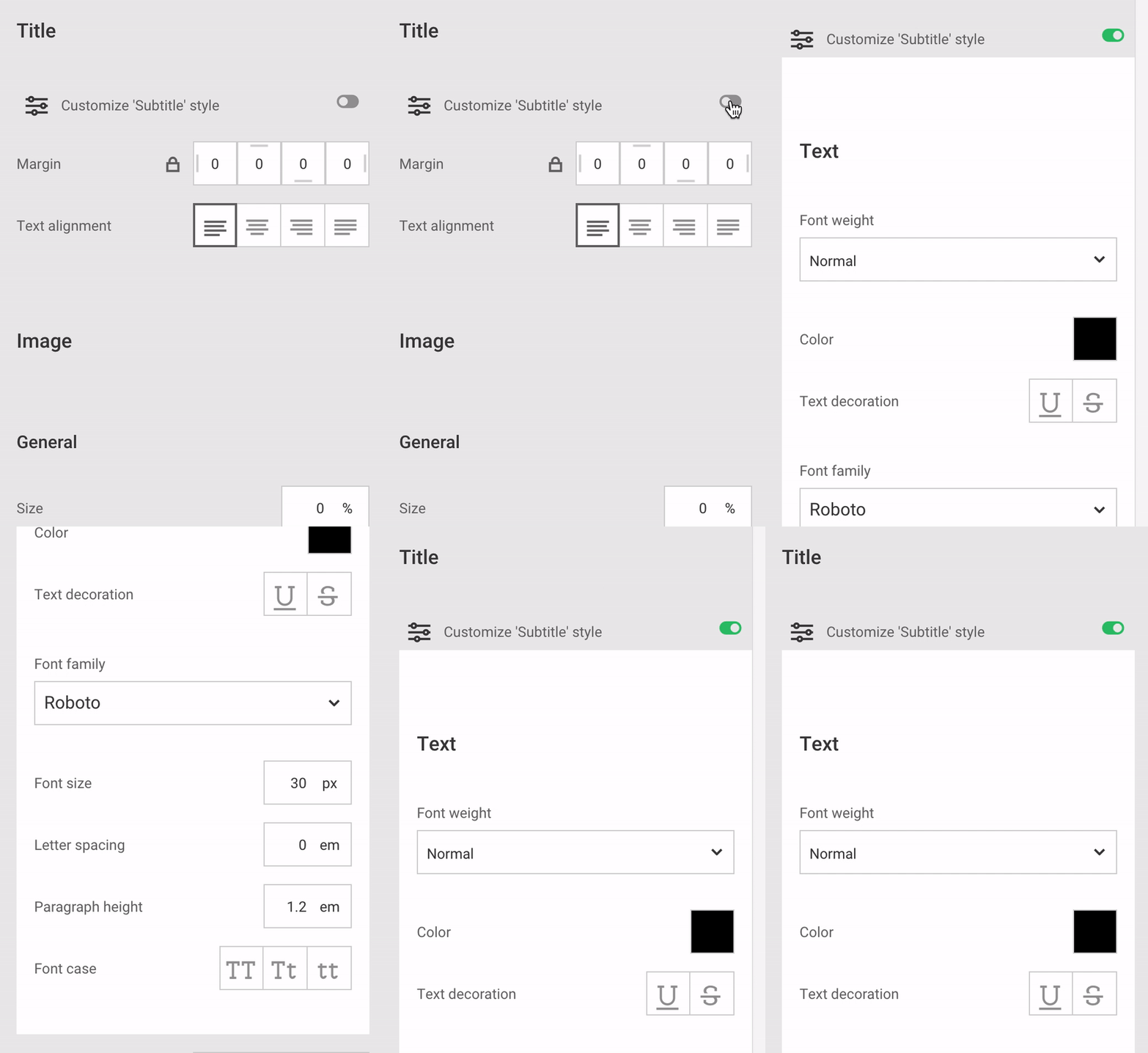
In some areas of the Editor, you will find that you have the option to customize the text or title styles. This option gives you the flexibility to style text elements of particular modules differently than the style it inherits from Global Design. The options include text styles such as Headline, Body, Button, Small text, Subtitle and Preamble. When toggling this option on, you will now have the ability to customize the following:
- Font weight
- Color
- Text decoration
- Font family
- Font size
- Letter spacing
- Paragraph height
- Font case
- ... and more
Does customizing the text style impact Global Design?
Customizing the text styles using this option will not impact the Global Design of the element. Changing any value with this setting will only impact this particular instance.
Transition type
Transitions can be applied to navigation elements. They are used to create a smooth transition effect between the normal and hover state. Find out more about transitions here.