The user login and the user profile pages are two elements that can be styled when setting up Customers on your website. Naturally, both elements inherit styling from Global Design in order to make their appearance consistent with your design. However, you are able to change the styling of both elements if you prefer.
User login
The User login section found under Customer engagement in the Global Design menu allows you to style the elements for the login form. The options provided to style the User login module include the following:
- Button alignment
- Login link
- Overlay
Below is an example of a User login module.
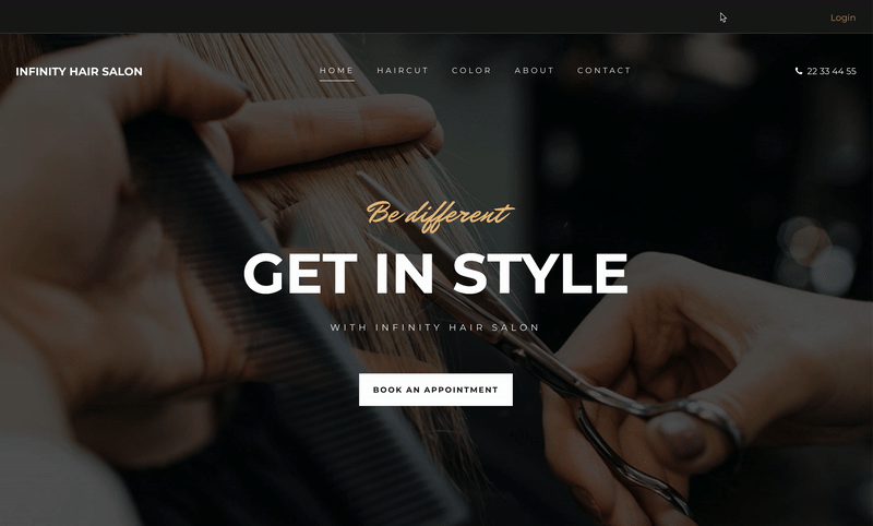
Where can I add the User login module?
The User login module can only be placed in the header and/or footer of the website.
Button alignment
With button alignment, you can choose to align the user login form to the left, center, or right of the website.
Login link
When styling the login link, you have many options that include customizing ‘Small text’ style that the link inherits from. Options here include:
- Font weight
- Color
- Text decoration
- Font family
- Font size
- Letter spacing
- Paragraph height
- Font case
You are also able to style characteristics of the background color and border, including style, color, thickness, and border radius. Lastly, for the login link, you can adjust the spacing using margin and padding to meet your needs.
Overlay
The overlay includes elements such as the title, input fields, forgot password link, request access link, and button. Each of these elements provide you with the ability to customize the styling further and these options include:
- Font weight
- Color
- Text decoration
- Font family
- Font size
- Letter spacing
- Paragraph height
- Font case
The button element provides you with a few additional options such as:
- Button alignment
- Button float
- Button width
- Icon color
- Icon size
- Icon spacing
Finally, like all other modules, there are general styling options such as background color, border, and spacing options for the overlay.
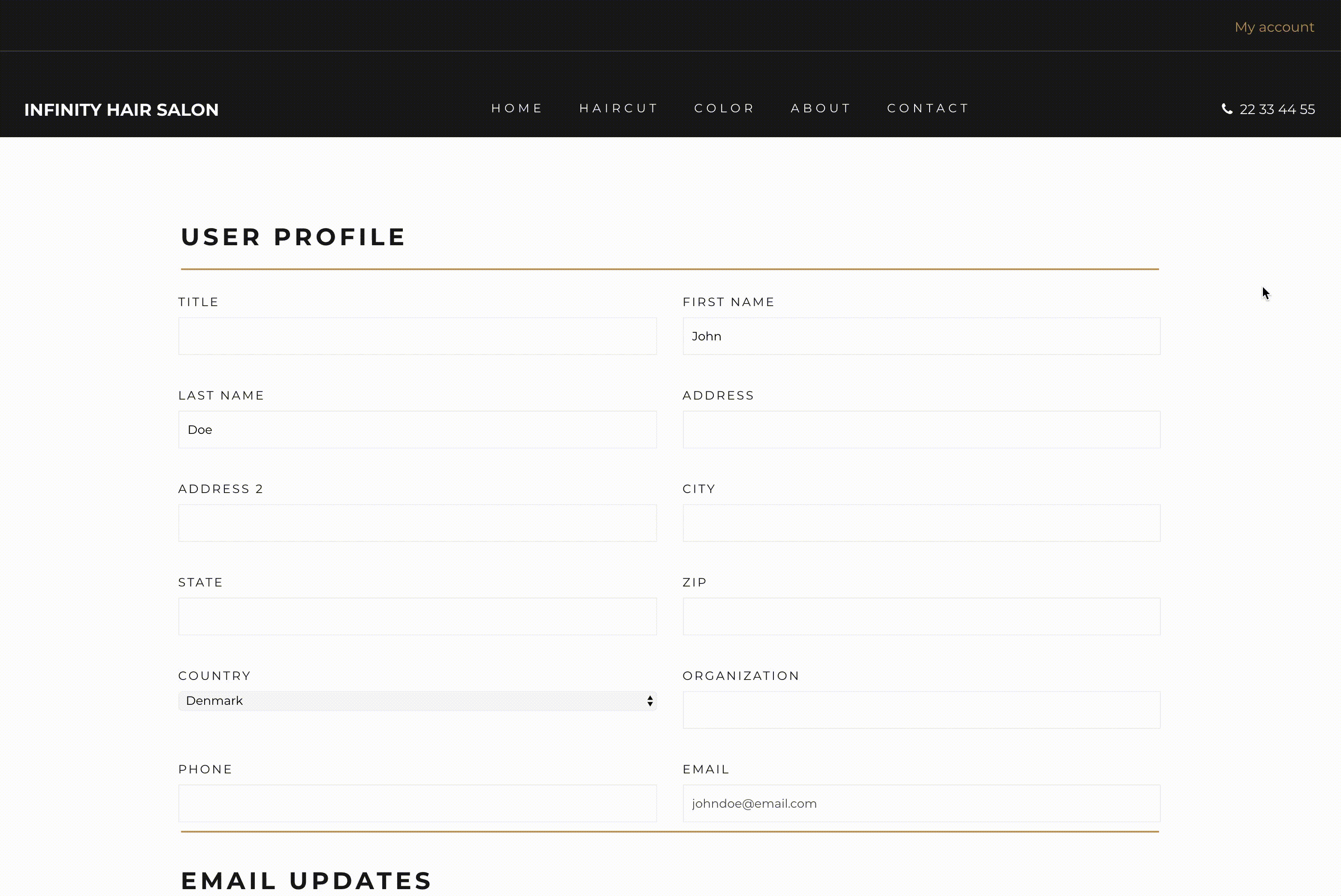
User profile page
The user profile page section found under Customer engagement in the Global Design menu allows you to style the elements for the profile page the user will fill out. When selecting this option, you will be taken to a page template where changes you make will be visualized in the Editor’s canvas. The options provided to style on this page include the following:
- Background
- Headline
- Input field labels
- Checkbox/radio labels
- Text in fields
- Save button
Below is an example of a user profile page.
Background
Changing the color of the background will affect the color of the entire page background. You are also able to add a background image and if you choose to do so, you will see more options such as image repeat, size, and positioning giving you ultimate control of your page. You also have options to adjust the margin and padding of the page.
Text and fields
The content making up the user profile page inherits from different elements of Global Design, however you do have options to customize the style of each, such as:
- Font weight
- Color
- Text decoration
- Font family
- Font size
- Letter spacing
- Paragraph height
- Font case
The Save button element provides you with a few additional options such as:
- Button alignment
- Button float
- Button width
- Icon color
- Icon size
- Icon spacing