Use buttons to guide your visitors to other pages on your site or to an external URL - or for downloading files and sending an email. You can add a Button module by selecting Button under the category Page navigation in the Add module overlay.
To edit your Button module after it has been added, double click in the module or click on the Edit icon. You can then expand and edit options under Content, Design or Settings in the module overlay.
Content
Start by adding a text on your button.
You can also add a concise title tag if you wish. Using a title tag provides more context about your website and can help improve search engine visibility. Additionally, most web browsers display the title tag on mouseover to allow visitors to see where the link will take them before they click on it.
You can link your button to either an external URL, a page on your website, an email, or a file.
Creating a "click to call" button
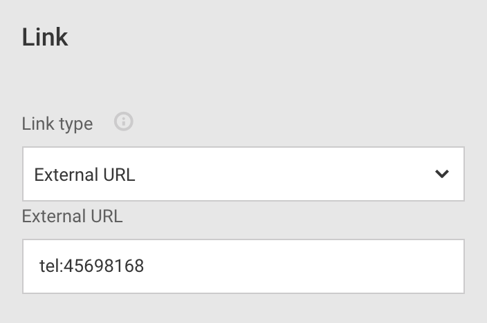
You can set up a button to call a phone number when a visitor clicks it. The button triggers the device's default call application and dials the number. In order to create a "click to call" button, select External URL and type in "tel:" followed by a phone number.

If you want to use the phone number you have entered in Global Data, input the following: tel:[phone]. Remember, you can hide buttons on specific viewports if you don't want them to show up (in this case, it might not make sense to have a "click to call" button on desktop viewport while it's more relevant on mobile view). Read more about adapting your website to viewports here.
When linking it to an email, the visitor's default email application will open when they click the button and create a new email message with the email you entered in the "Email" field as the recipient.
When linking to a file for download, the visitor's browser will trigger the download when they click the button.
Supported file formats
If you're linking your button to a file download, keep in mind that only the following formats are supported: .png, .gif, .jpeg, .jpg, .xls, .xlsx, .doc, .docx, .pdf.
Finally, you can add an icon either to the left or right of the button text label by selecting one from the list.
Design
Apart from aligning your button left, right or center within the column you can also set the button to float, adjust the width, and determine the margin.
- Float: use this feature for wrapping text around your button. You can float the button to the left or the right. Floating multiple elements will align them side by side.
- Width: instead of having the button's size dependent on its content, it's possible to define a fixed width for it. The percentage is related to the width of the column where the button is inserted; this means a button width of 25% occupies exactly a quarter of its column.
- Margin: adjust the amount of spacing outside of the button.
Adjustments after adding float to a button
When adding float to your button it's recommended to set some margin on the right or left depending on the float direction. Add margin to the bottom to push the wrapped element away from the floated element.
Example of float:
Click More local design options for additional styling options. You can, among others, adjust background color, border and text in various states. For more information on styling, read our dedicated guide here.
Fixed position button
If you want a button to pin on the visitor's screen and stay there as they scroll up and down a page, you can toggle Fixed position in Design > Button > General. Read more about fixed position buttons here.
Settings
It's possible to track how many times visitors have clicked the button. Give your button a name for tracking purposes and write it in the field Custom tracking name. The data will feed into the your Google Analytics statistics.