Having a responsive website that looks great on all three viewports - desktop, tablet and mobile - is essential for ensuring a good visitor browsing experience. The three viewports are, therefore, important elements to take into consideration when building websites in the Editor where creating viewport-specific layout and design is easy.
In the Editor, it's possible to include unique content for each viewport without compromising the source code which remains a single HTML page.
Viewport-optimize your website
One of the main differences between the three viewports are their width. With an easy-to-use viewport interface, the Editor makes it simple to modify a website to suit all viewports.
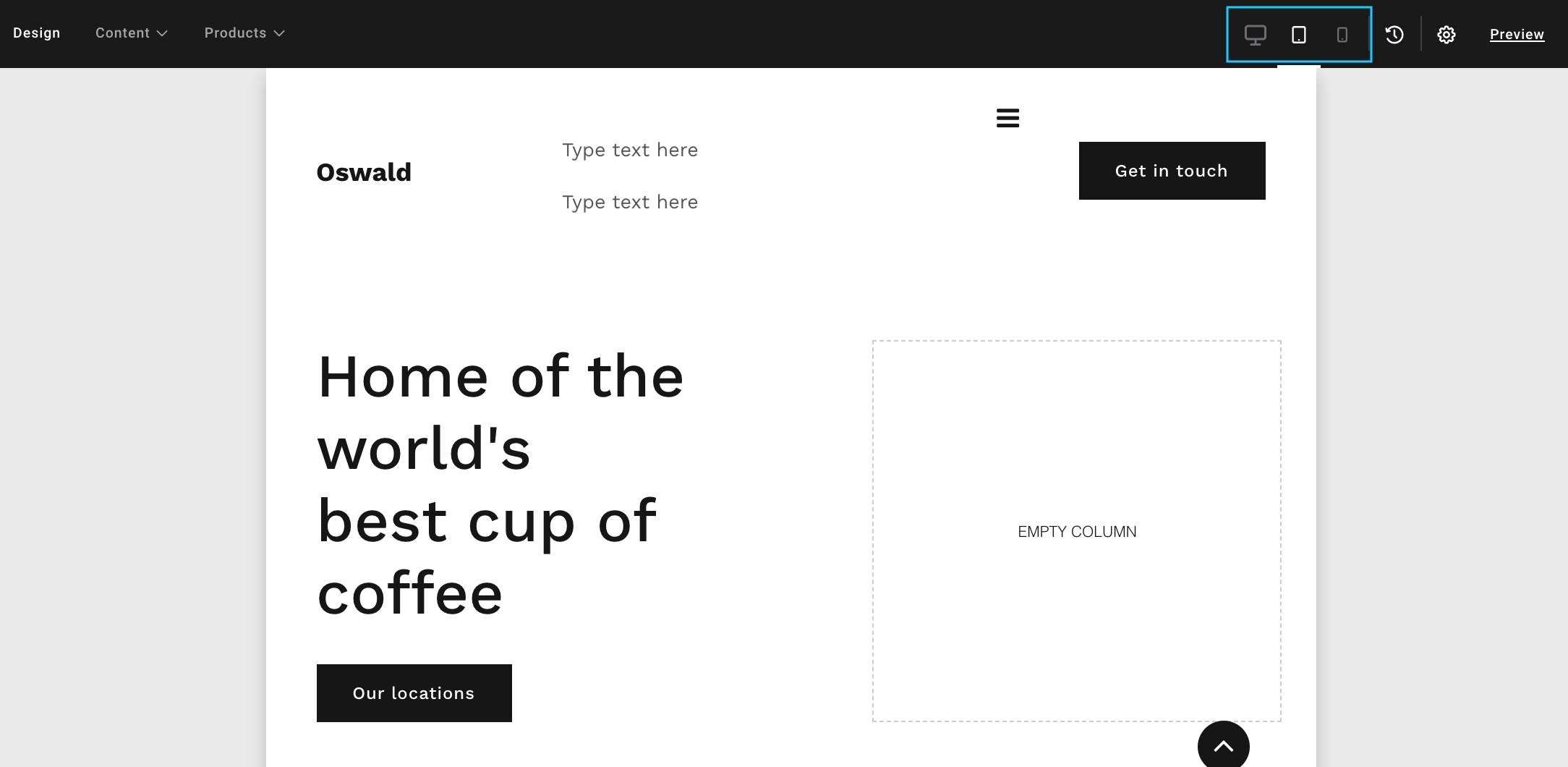
You can switch between viewports by clicking the three icons at the top of the Editor interface.

Use the keyboard shortcut
Switch between the viewports by using the keyboard shortcut Option ⌥ + V (Mac) / Alt + V (PC).
Hierarchy when adjusting viewports
The Editor operates a strict hierarchy when it comes to viewports to make it as easy as possible to work with the different viewports. The desktop viewport is by default the "master" of the viewports meaning that adding new modules and making edits on desktop also affects tablet and mobile, if those viewports haven't been adjusted manually.
You can add modules on all viewports. The added module will automatically be included on the other viewports, but you can only delete modules from the desktop view.
Tablet is second in the viewport hierarchy meaning that changes on tablet view are also visible on the mobile viewport but don't affect the desktop viewport.
Finally, any changes made in the mobile view don't affect the other viewports.
Overview of viewport hierarchy
- Desktop: affects tablet and mobile
- Tablet: affects mobile
- Mobile: doesn't affect the other viewports
The viewport hierarchy "breaks" for rows, columns or modules once you modify one of the elements on one of the viewports individually. For example, when you modify a row on tablet or mobile and afterwards change something on the same row in desktop, the changes on desktop will not affect the other viewports. This is to help you avoid overwriting viewport-specific modifications and design every time you change something on desktop or tablet.
Be aware that the above doesn't apply to the positioning of elements. If you drag rows, columns or modules to a new position on mobile, they will also be moved on tablet and desktop, and so forth.
Change of column width
What may look good on desktop view might not look as great on tablet or mobile view. Therefore, in order to keep the images visible and the text readable, it's important to adjust the column width between viewports to improve the user experience. To an extent, this happens automatically based on responsive design. However, you have the option to further customize column width per viewport if you think a different width works better for your specific content.
Change column width for a specific viewport by navigating to the viewport interface from the Editor navigation. Once you're in the specific viewport interface, drag the column right or left to set the width.
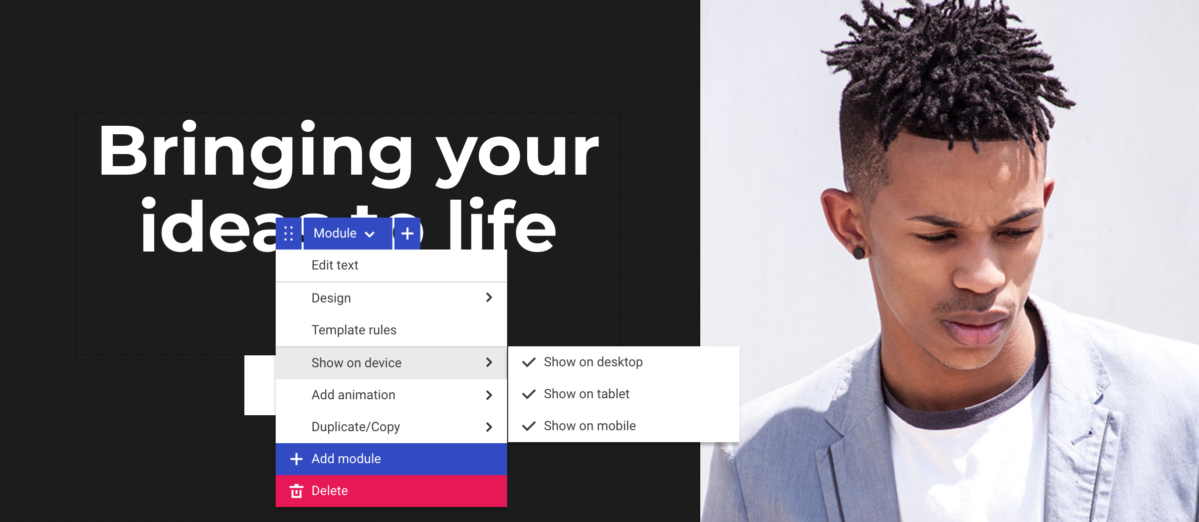
Hiding rows, columns and modules
Sometimes it makes sense to hide specific elements on different viewports. Click on the row, column or module you want to hide, select the Show on device option and tick the viewport(s) you want to show the element on.
Hiding elements
You can't hide elements on the viewport interface you're currently working in. For example, if you are working in the mobile view in the Editor, you won't be able to hide elements from mobile view. To hide something from mobile view, you have to instead be in the tablet or desktop view in the Editor.
Behavior on mobile is often quite different from desktop and tablet, which might require different customer engagements or calls to action. For example, you might want to have a "click to call" button on the mobile version of your website but not on the desktop and tablet versions. Using the Show on device function will enable you to achieve this by hiding the button on desktop and tablet.