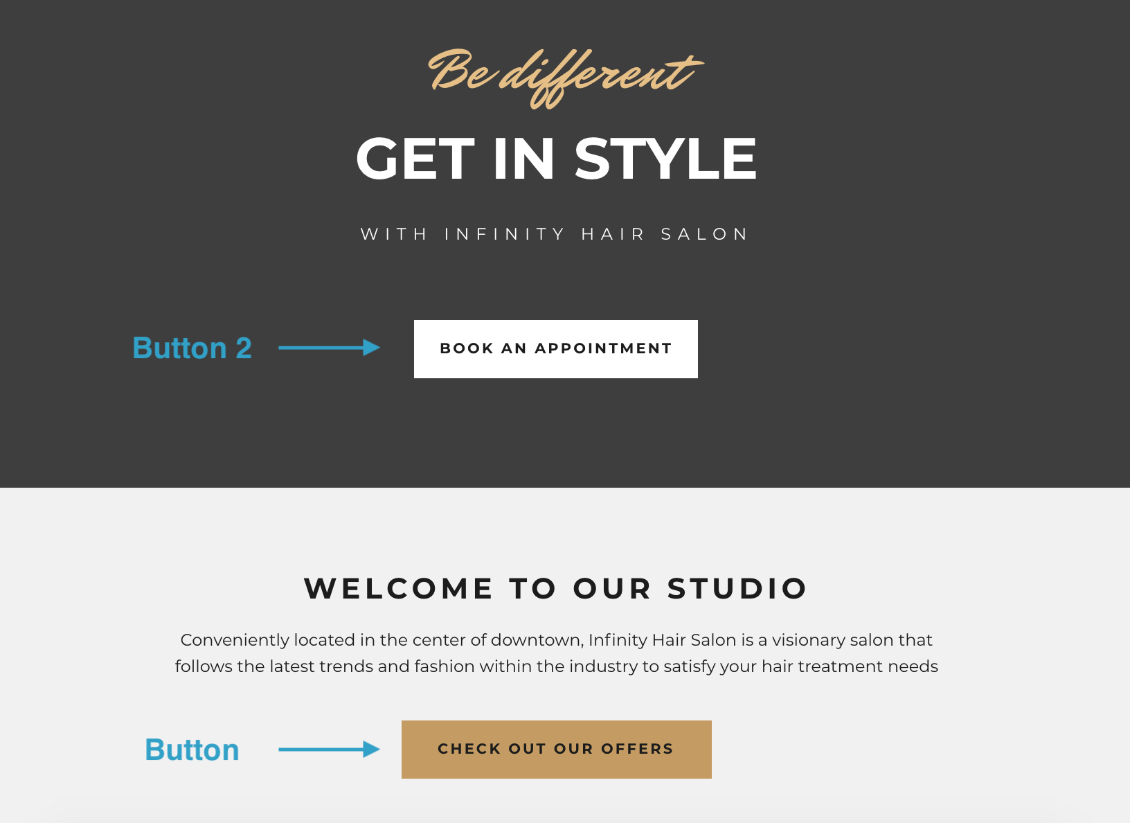
Buttons are essential components for visitor navigation and you will likely have quite a lot of them plotted around your website. For the same reason, it might not be enough for you to only have one button style. To help you add more visual diversity to buttons, the Editor allows you to design alternate button styles thanks to the Button 2 and Button 3 modules. You can add Button 2 and 3 modules by selecting Button 2 or Button 3 under the category Page navigation in the Add module overlay.
How are Button, Button 2 and Button 3 different?
The three button modules are completely alike in functionality. The only difference between Button 2 and 3 is that Button 3 inherits the Global Design properties from Button 1 while Button 2 doesn't inherit any styling.
The idea of Button 3 inheriting styling from Button 1 is that you can have two types of buttons that look similar but differ in a few parameters such as text color or size of the button. This makes it easier for you to differentiate design elements on a more granular level, without needing to style elements locally.
You could then style Button 2 completely differently from Button 1 and 3. For example, you could style it in light colors so you can use it on darker backgrounds where Button 1 and 3 might not be ideal.
Examples of use
Your default Button is styled with a dark background color so it's clearly visible on rows with light colors. However, you have a few images in dark colors and you would like to put buttons on them. Obviously, the dark button would hardly be visible on those images so you design an alternate button style - Button 2 - and make it white so that it stands out on darker backgrounds.

Here's another example. You have many images on your website, some bigger and some smaller. You'd like to place a big button under your larger images and a small button to be placed under smaller images.
In this case, you may have styled your Button in Global Design to be bigger in size and your Button 2 to be smaller. Doing it this way, you don't have to spend time making individual changes locally when you want to differentiate button styling.