The simple color fix
When selecting Global Colors for your website, a simple rule is to keep the color gradient hierarchy from light to dark ensure a consistent design where all elements are readable and the website looks visually balanced.
Recommendations for use of colors
What we recommend as a rule of thumb is that you pick your main color (spot color 2) and create a light (spot color 1) and a dark (spot color 3) version of it. We additionally recommend you to add a transparent version of your main color (secondary color 1) with an opacity of 80% = 0.8 in the Editor. Be aware that this transparency level is a general recommendation and you might find it too opaque for your design, in which case you can simply adjust the opacity level.
Using color contrasts
If you feel like differentiating the look of the website you're working on, adjusting color contrasts is a great way to do so. When using color contrasts, we recommend you to change your light color (spot color 1) to another contrasting light color as shown on the image below. When changing this color, it's very important that you still keep the color gradient hierarchy by choosing a light color, as spot color 1 is mainly used as a highlight color on the site and is not the main color but merely complements spot color 2.
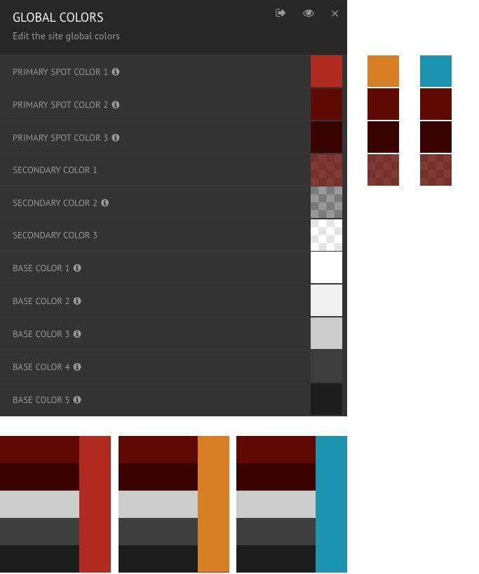
How to use color contrasts in practice
When choosing your light spot color, we recommend that you use a color with the same finish as your other colors - e.g. if you use colors with a pastel look, choose a light spot color 1 with a pastel finish but set it to be a different color that your other spot colors.
The image above illustrates the two different solutions. The orange light spot color is not adding major contrast to the red colors but enough to give the site a little edge. Using a blue color together with red gives even more contrast to your color palette. Below you can see what a typical module group on a website would like when having a blue spot color 1 with a red color palette.