Recommendations
Please note that the following are only recommendations based on what we think works best in the Mono Editor - they're not final answers that must be followed to the point.
Pixels and file size (general)
Pixels and image dimensions are not only a question of what is recommended for our Editor but also of the specific visual expression you're aiming for on your websites. Our recommendations for pixels and dimensions are therefore primarily based on image width as width is important for a website with responsive design whereas height is primarily a question of design preference.
Why is width important?
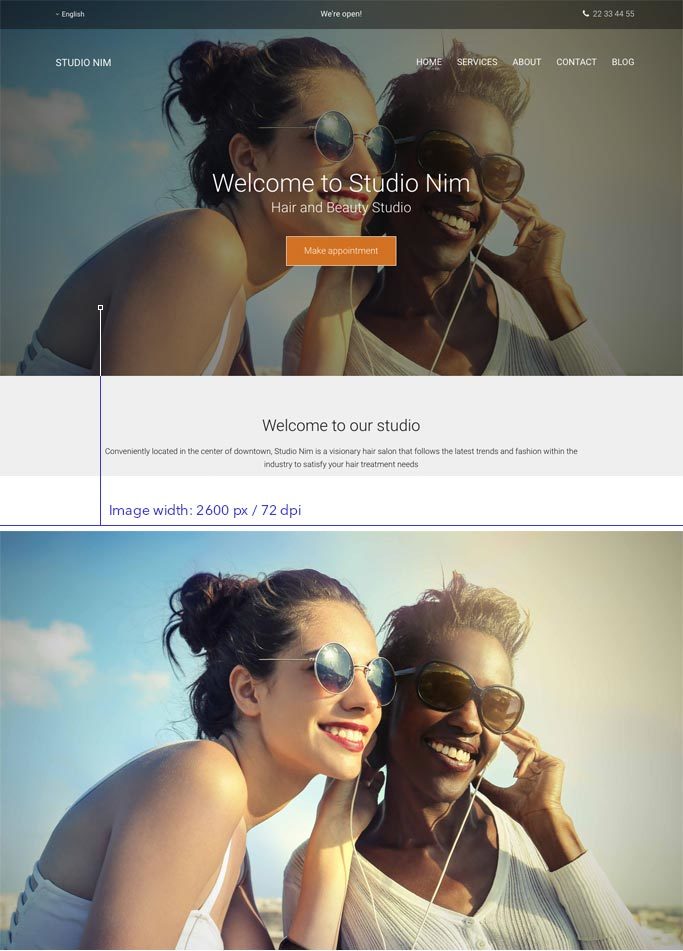
Using images with a certain minimum width ensures that they will always look good on responsive websites, regardless of the visitor's screen size. We therefore recommend an image width of 2600 pixels or more for cover images that take up an entire row. In fact, the number 2600 is good to keep in mind also if you have more than one image in the same row as the total width of all the images combined should add up to 2600 pixels.
Examples
For example, if you have three images next to each other, each image should be at least 866 pixels wide (as 866*3 = approx. 2600).
Recommended pixel width: 2600 pixels or higher (72 dpi)

Width for fixed rows
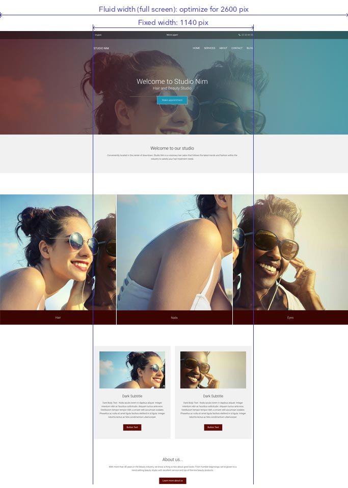
Using a template with fixed row layout obviously changes the requirements for your image dimensions as the width of a fixed row is 1140 pixels for the columns. Don't worry, you can still use the same images as on your fluid rows with 2600 pixels or higher. Include the image you have in 2600 pixels and the Editor will automatically generate an optimized version for your fixed rows once you publish your website.

What about height?
The height of your images are also an important dimension but this is more a question of appearance and taste than responsive behavior. The most important thing to keep in mind when settling on a height for your images is that it's the same for all images you're planning to place immediately next to each other. Read the section "using two, three or more images" below to get more information about image height.
Be aware that the look and feel of the row changes according to your image height as it dictates the height of the column the image module is placed within. If the image is included as a row or column background, the height of the image is determined by the spacing settings of the row/column. If you want to display more of your selected image, add more spacing to the row or column.
File size of your images
The file size of your images is important for page loading speed. The Editor automatically compresses your images to help your website load faster but we still recommend that you upload images no larger than 200 kb in size.
Try to use images that don't exceed 200 kb
Cropping images: using several images in one row
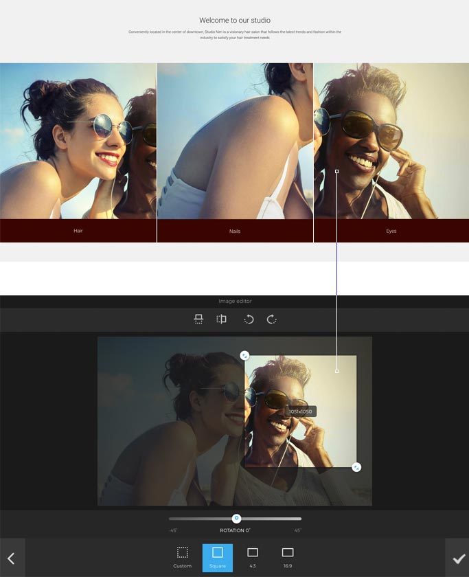
Our templates often use two or three images on a row to promote products, services or introduce staff members. When using such layouts, the requirements for image pixels change. The Editor boasts an integrated Image Editor (LINK) which is a great tool for making sure your images come in the correct pixel sizes without having to use third-party applications for cropping and resizing. The Image Editor is simple to use and comes with size presets that help you save your images in a specific size/format.
Note
Please notice that the following recommendations are based on images that are used on fluid row layout without any spacing added between them.
Using two, three or more images
When using either two, three or more images on a row, the requirements for images are the same as above. We recommend that you adhere to the following two rules:
- First, make sure that the total width of your images are 2600 pixels or more to optimize for responsiveness. If the width is less than 2600 pixels, the appearance might change on a large desktop screen and include unwanted space between the images. The specific width dimension depends on the number of images (columns) you have in a row. So, if you have three adjacent images, each image should at least be 2600/3 = 866 pixels. If you have four adjacent images, each one should at least be 2600/4=650 pixels.
- Second, make sure that your images are the same height to ensure that they have a consistent and streamlined look.

Cover image on viewports (row background)
Using images on a website often requires you making specific adjustments for each viewport. It's important to stress that the Editor ensures that you don't have to make any viewport-specific changes but we still recommend you to optimize your use of images on the three viewports to ensure a good user experience.
Tablet and mobile view
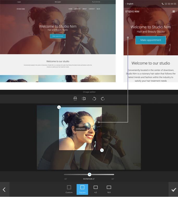
For tablet view, we recommend you to only change the positioning of your existing image due to its slightly different dimensions from desktop.
For mobile view, we recommend you to change the dimensions of the image as mobile view by default is more squared than tablet and desktop. It's therefore recommended to use the Image Editor to crop the cover image to squared, which is one of the presets within the Image Editor.
