A button is a fundamental element of your website that users can interact with. Buttons can persuade users to convert or carry out a specific action, but as a designer, it is your job to design the button in a way to make the user take that action.
Basic rules for button design
Buttons are easy elements to style, but there are some factors to consider when doing so. You want to choose a style that both suits your website design and allows the button to be easily discoverable.
- Make it look clickable
- Make it easy to find
- Clearly state the action
- Size matters
- Don't overwhelm users
- Visual interaction
Make it look clickable
Use shapes and styles that users are familiar with. Originality isn't always best. It may look beautiful, but it may not be perceived as a button.
Make it easy to find
Consistency in button styles across the website is key, along with using contrasting colors. You should direct user's attention to the button.
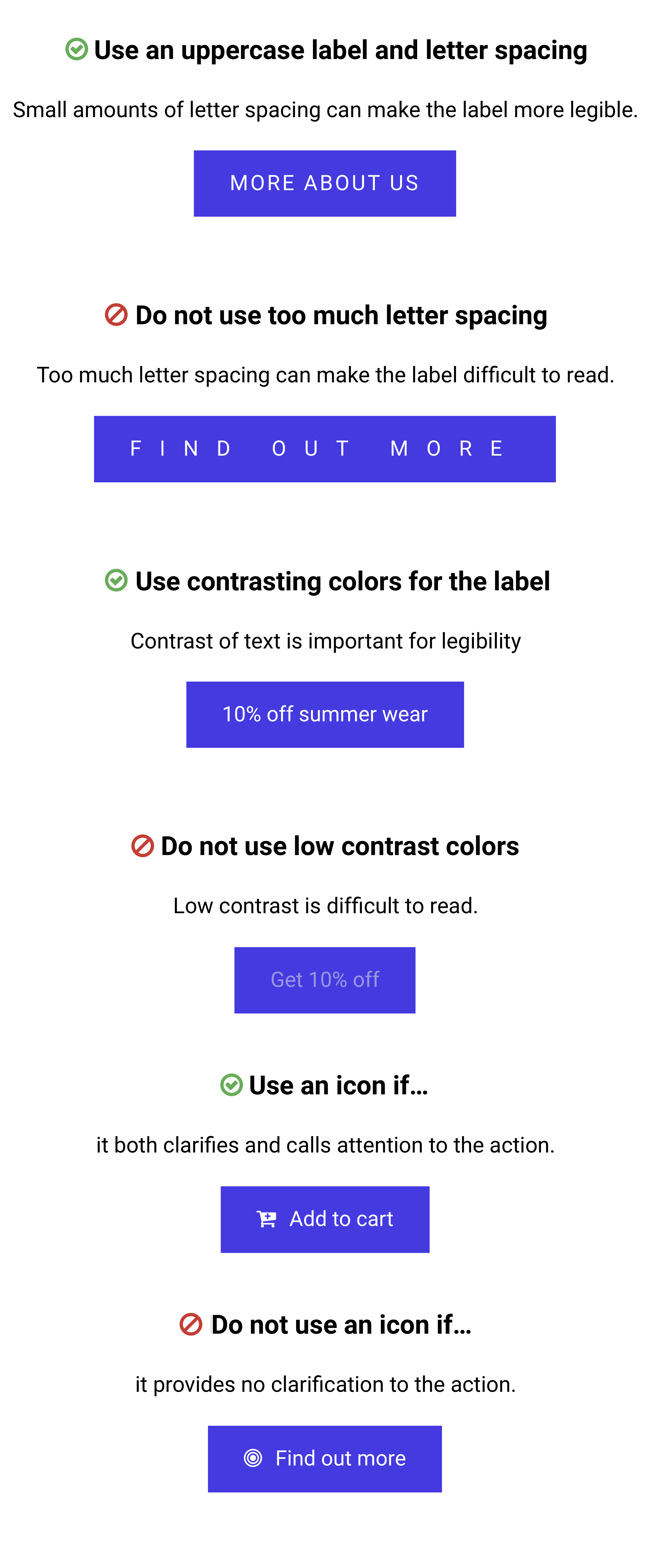
Clearly state the action
Focus on the action of the button and label it accordingly. Generic labels are not helpful in letting the user know the action.
Size matters
Size not only matters to create a visual hierarchy of your buttons, but mobile users should have a large enough tap area - minimum 42px.
Don't overwhelm users
Find ways to get users to reach the desired outcome in a logical way. Placing buttons for all pages will be overwhelming.
Visual interaction
When a user interacts with a button, it should change state, letting the user know that something is happening as a consequence of their actions.
Anatomy of a button
There are many design elements that make up a button. Styling these individual items can create effective and attractive buttons that persuade users to interact with them.
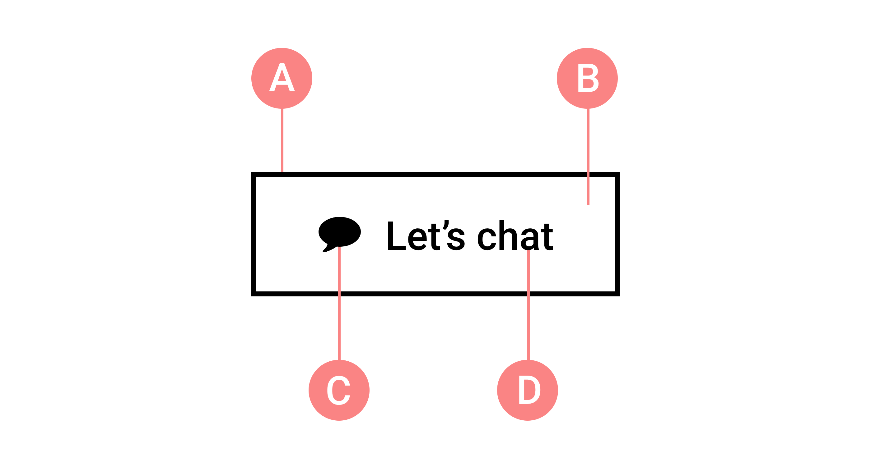
A. Border
B. Background
C. Icon (optional)
D. Text label
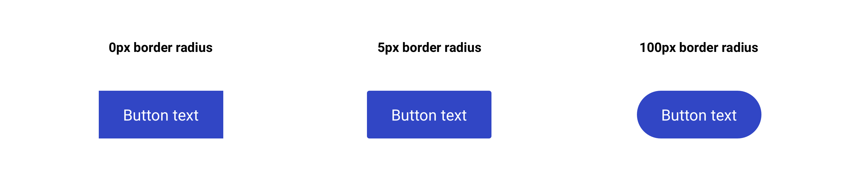
Button border
One styling element that can drastically change the appearance of your buttons and the feeling of the website is border radius. Changing the value for the border radius you can make the button square, completely rounded, or anything in between.
Boxed buttons are typically seen as reliable, uniform, traditional, and professional
Rounded buttons are typically seen as charismatic, endearing, harmless, and friendly
Visual interaction
Choosing the proper visual interaction has a major impact on the design of your buttons. Applying too many changes when the user interacts with the button can result in a dissatisfying appearance. However, the right color combinations when hovered upon can create an impactful visual interaction.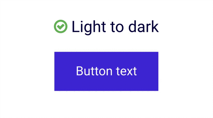
Clearly state the action
Clearly stating the action of the button is important in letting the user know what will take place after interacting with the button. However, you are also able to make certain style changes to the text in order to make the action stand out and clearly legible for the users.